This card is from SVS Magic of Color.
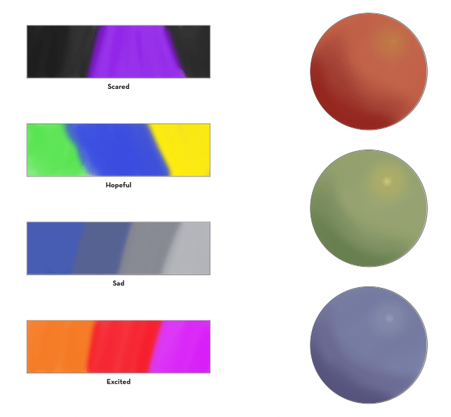
This lesson is about more issues with color selection and color mixing. We will get into this topic more as we go, but colors should be picked and designed for a piece to convey an emotion. You don’t want to just pick the real local color, but design the piece. So the same room/objects in a happy scene will have different colors from a sad scene. Special attention should also be paid to grays and browns so that they aren’t muddy and dull, you want to develop an eye for rich browns, which will have rich colors as the base. I had some trouble with this lesson, I’m not sure about emotional standards for colors. For one thing, I love a dark, gloomy day, it’s energizing for me, and even when I see ‘sad’ art, it looks cozy and comforting to me! So I need to keep that in mind. I also had trouble picking good browns. I picked a red, green, and blue and neutralized them, but it’s not a rich brown. I need to keep trying.
Next time I will try this in watercolor, and keep trying to get more experience with good browns in photoshop. I also maybe need to look at more art color schemes and look at emotion trying to be conveyed in scenes.
Photoshop using Huion tablet.
I did 30 minutes going through the lesson and then 30 minutes to complete this image.


Leave a comment