This card is from SVS Light and Shadow.
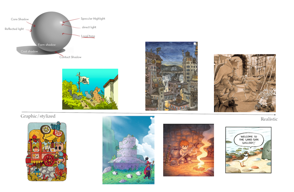
This lesson is about the different in lighting styles. Just because it’s possible to light things in a more realistic way, it doesn’t mean that you need to. Light can be flat and graphic, or realistic, or somewhere in between. This lesson has you look through art that you like and put them on the spectrum of flat to realistic. Most of the art I like tends toward realism with light and shadow, but I do like some artists that are more graphic looking. And it depends on the type of art too. I also like graphic art for wall art and for fabric. But when it comes to what I like to draw, it tends more toward a more realistic side of things.
Next time I will try to find a wider range of art to work with. I used all art that was in my ‘favorites’ instagram feed. But I can look for a wider range, for example Strawberry Luna, whose work I have purchased, but it’s very graphic in design.
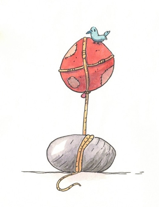
Photoshop using Huion tablet.
I followed along with the lecture, then spent about 30 minutes pulling this image together.


Leave a comment